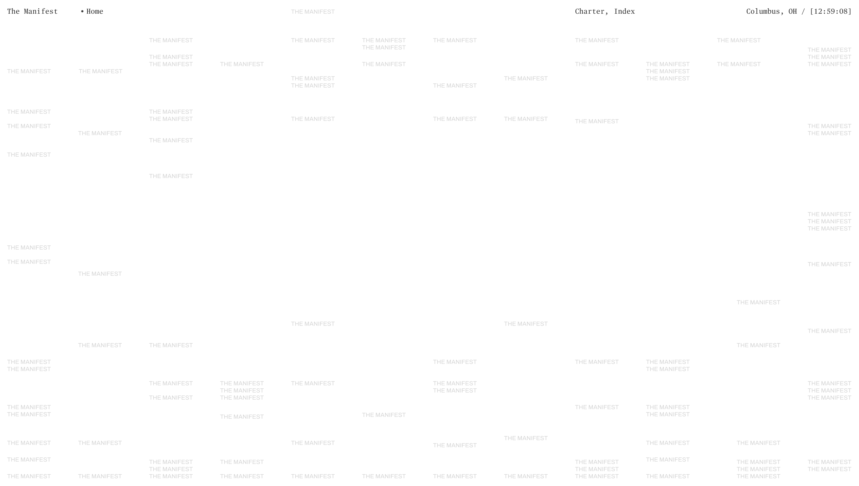
Studio Freight pulled me in to dev a "ledger of creative deconstruction"
They wanted a place to record hard-earned wisdom, and dive deeper into the minds of their team and industry collaborators.
The first thing I noticed was that the design was deliberately quiet. Mostly black and white, perfect alignment, square edges. It was clear that this platform was meant to serve the content, not compete with it. The assets and content of each article were to drive the vibe of the piece, while the site framed everything in place.
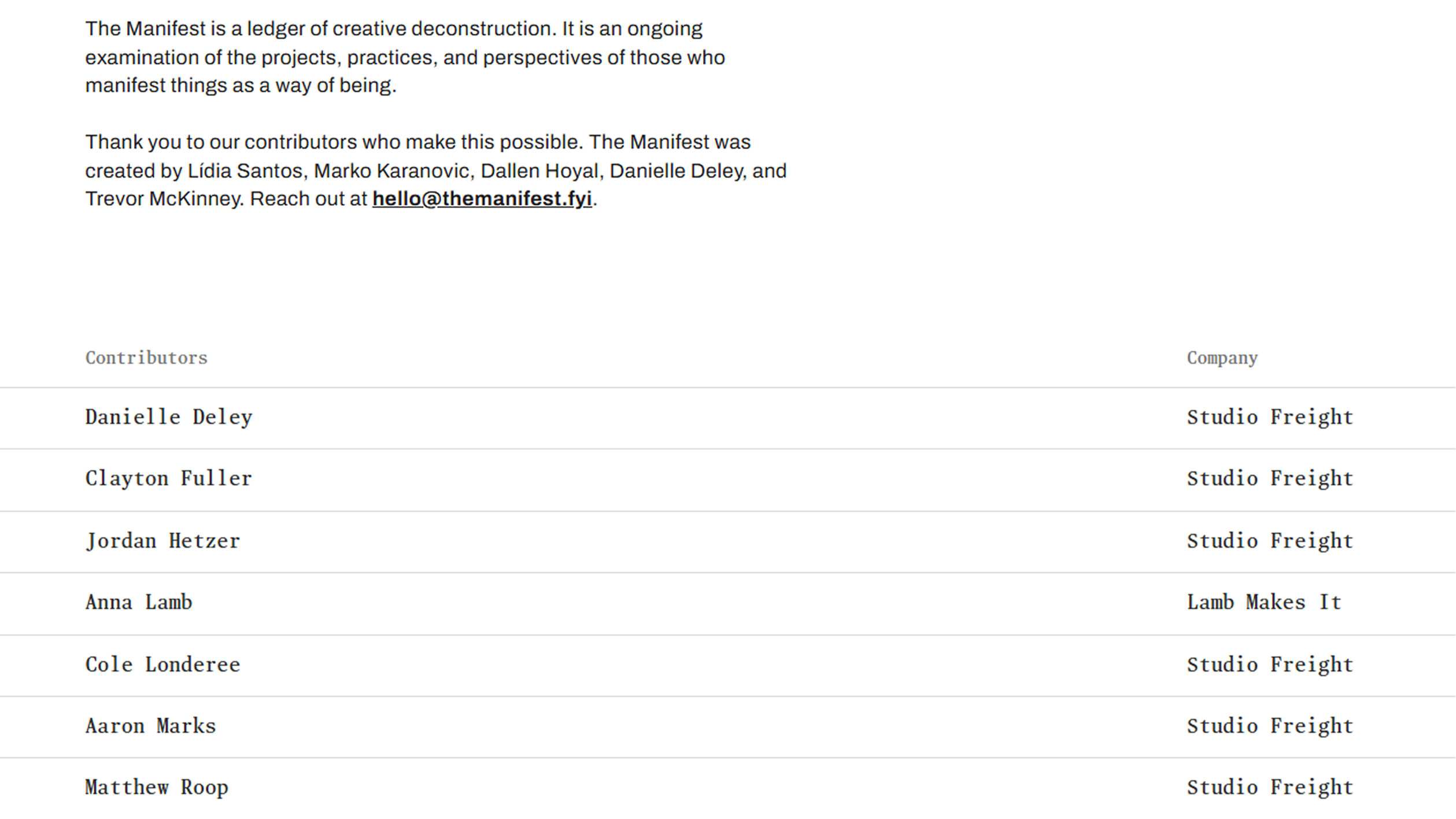
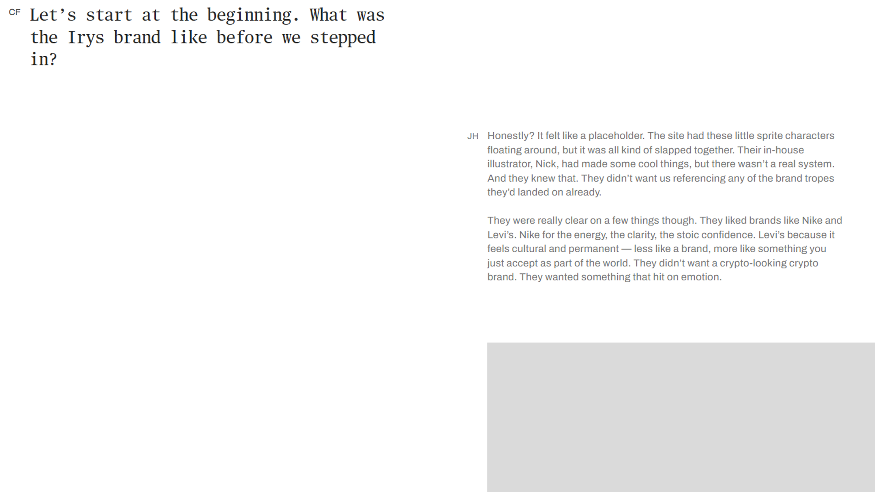
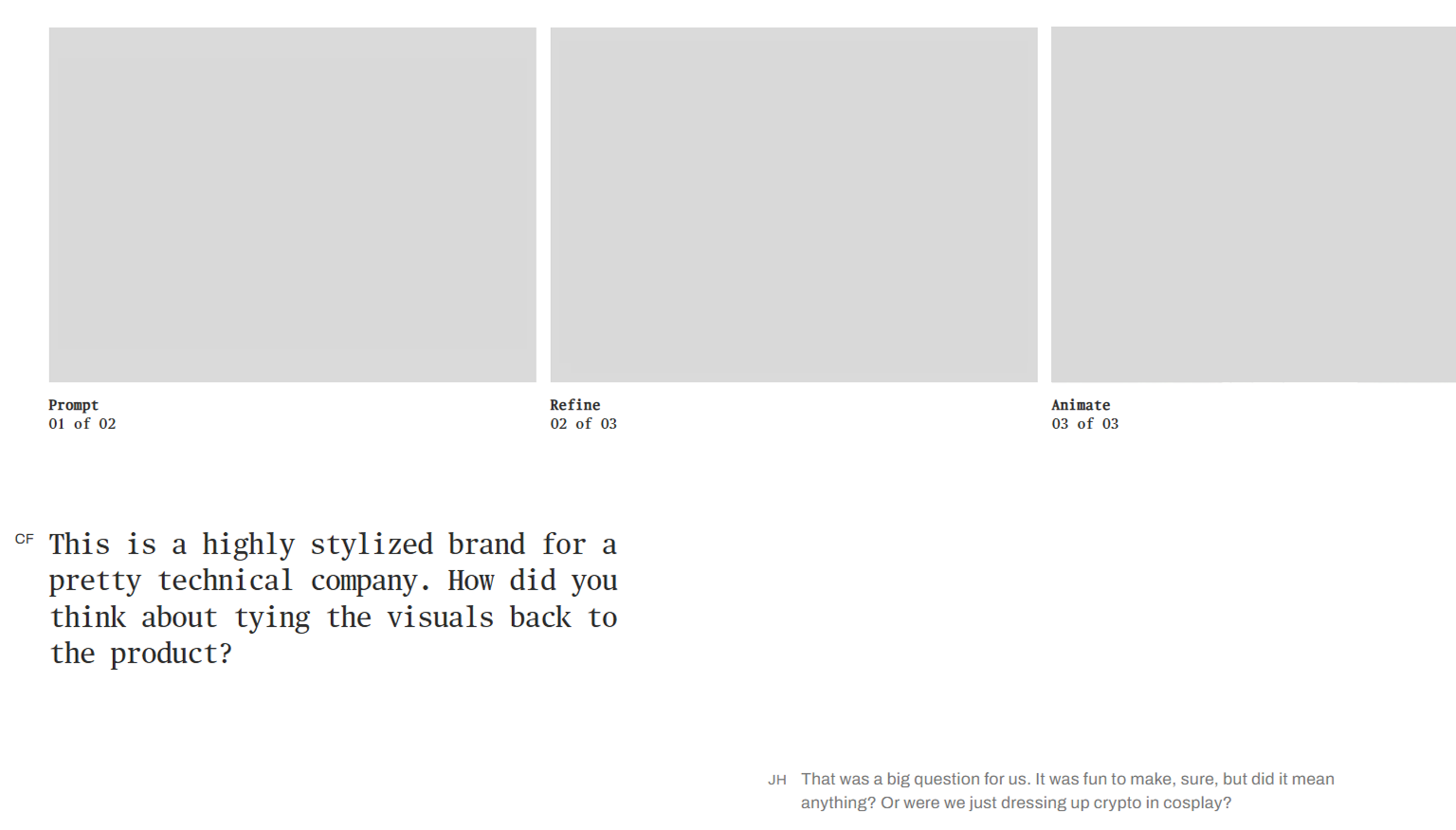
The articles needed to be modular. Studio Freight wanted to assemble new content quickly from mix-and-match pieces: text blocks, Q&As, image galleries, pull quotes — all the building blocks of a digital magazine. For the content manager, the experience had to feel fast and intuitive, ready to fill from day one.
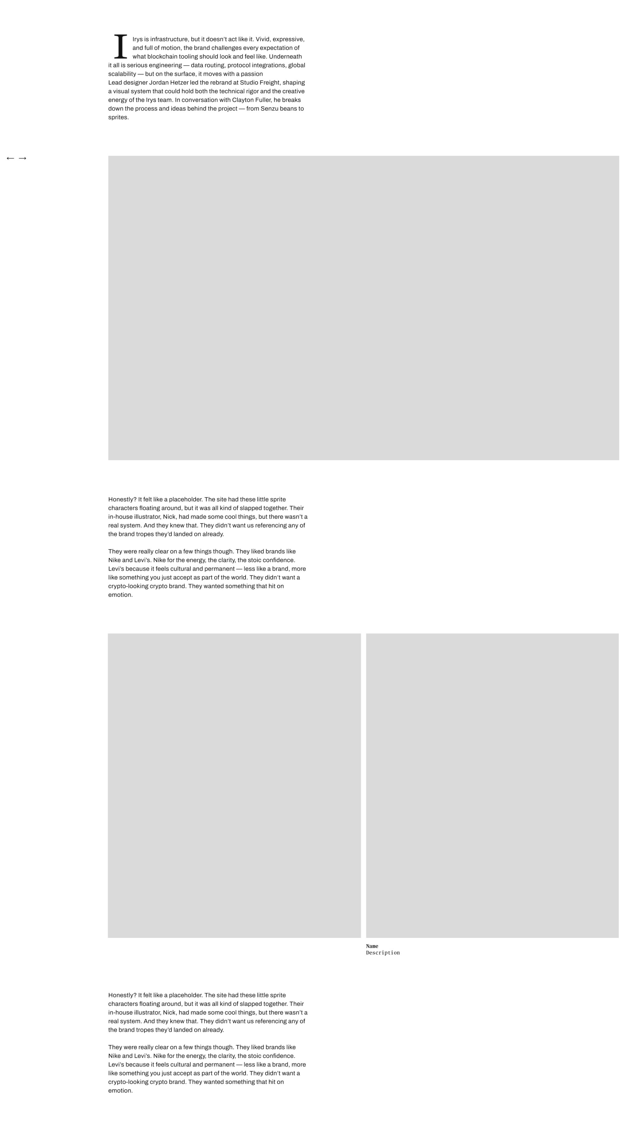
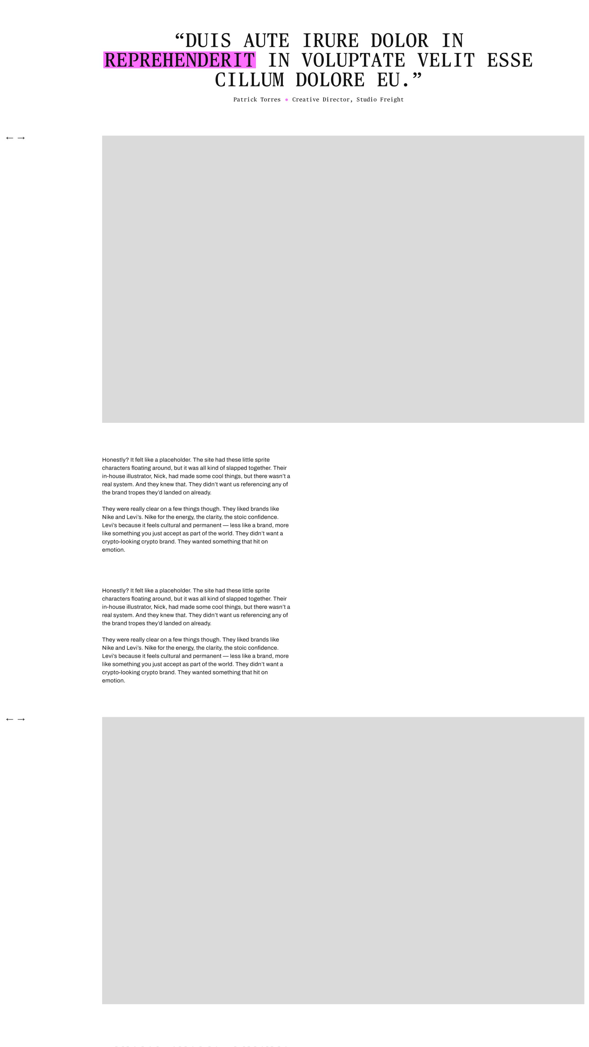
So I got to work...
and started matching the logical components from the design 1 to 1 in the Storyblok CMS.
The blocks were simple to map and add variations to. I spent a lot of time building up the CMS alongside the code components. I love the details when it comes to crafting the CMS. A cool site means nothing if the content system is too cumbersome for the content manager to use.
I ended up with twelve content blocks, each with variation options. The image gallery was the most complicated block in the code. It needed seven different image grouping variations, but always had to maintain the same total layout space. However, from the content manager's perspective, it was dead simple. Add an image gallery block. Select the layout you wanted from a list (one up, two up, two up offset, three up, etc.). Add photos.
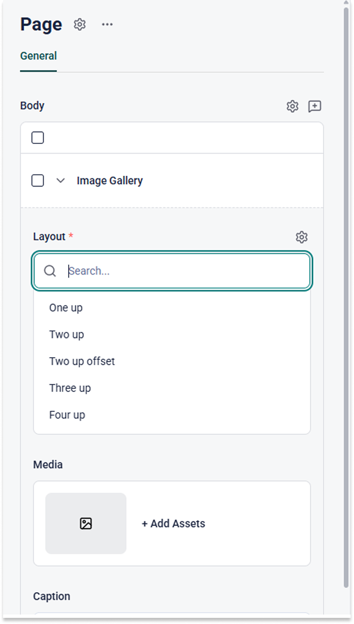
In the code base, I kept the gallery as a single component. It parsed the correct layout and adjusted the images within accordingly, while keeping all the general properties of the gallery centralized. This made it easy to extend if they decided mid-development that they needed a new image layout (quintuple up offset alternating spinning...). I would just add the option to the CMS, then extend the image gallery component to accommodate the option.
The finishing touch...
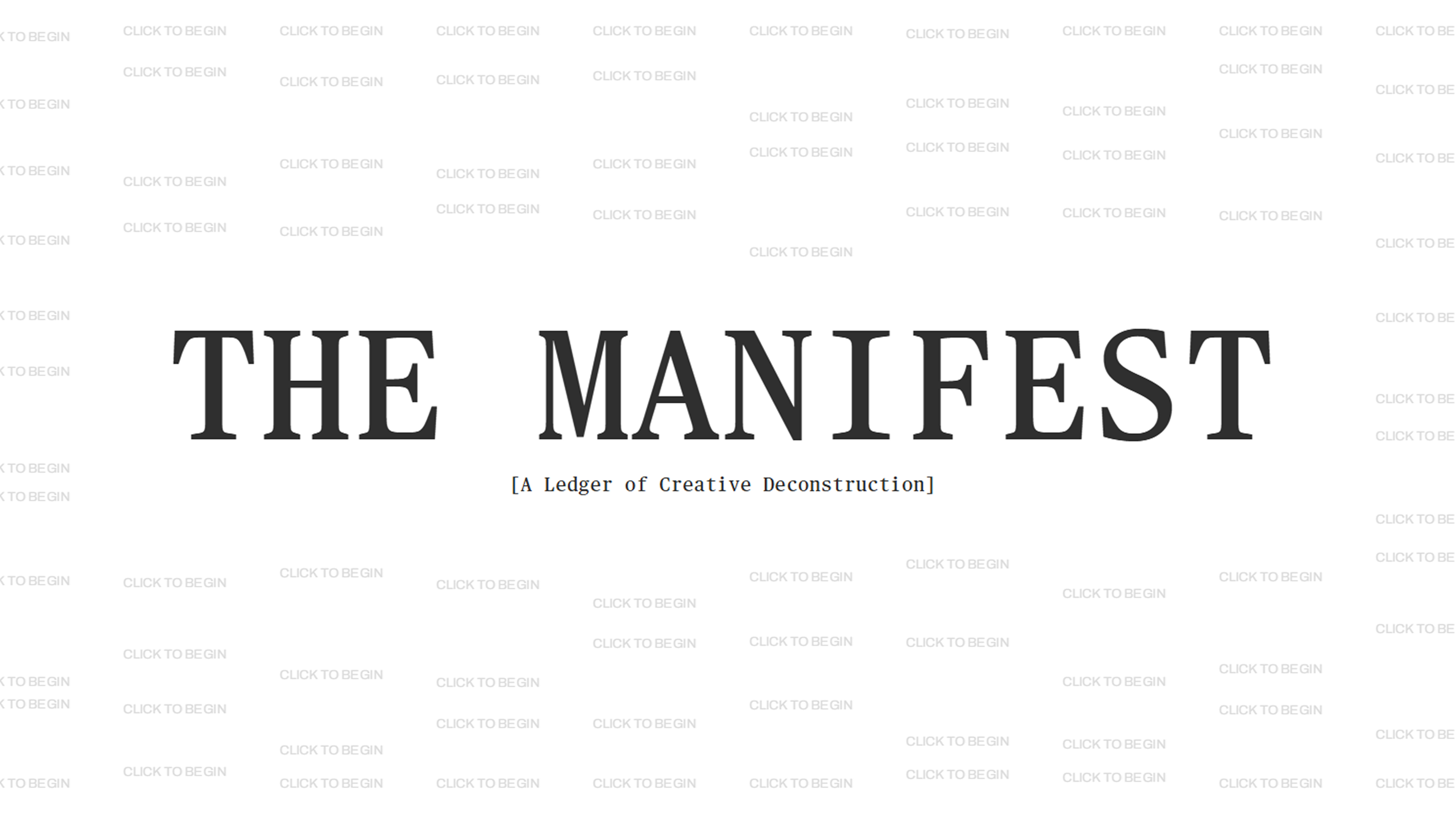
an interactive landing page.
The site's restraint made the landing page a chance to do something more expressive. We used GSAP for the text animations, but getting the physics to feel right was going to take a lot of fiddling — and that kind of fiddling lives more naturally in the designers' hands than mine. So I set them up with a live deployment where they could tweak all the parameters themselves: timing, easing, stagger, spring values, whatever they wanted. They dialed it in, I locked the values into the code, and we launched.
Check it out! The Manifest